Color sets the emotional temperature of a wedding before a single word is spoken. It is the first thing guests notice when they open an invitation, the thread that connects the ceremony arch to the reception centerpieces, and the visual signature that photographs carry forward for decades. Choosing the right palette for a spring wedding in 2026 means understanding not only what looks beautiful in March, April, and May but what feels intentional, cohesive, and unmistakably current.
Spring 2026 is moving away from the stark minimalism that dominated recent years. Couples are gravitating toward palettes rooted in the natural world: soft greens pulled from new growth, warm neutrals borrowed from raw linen and sun-bleached stone, and accent colors that echo wildflower meadows rather than paint swatches. The result is a generation of weddings that feel organic and grounded while still maintaining the elegance and polish that formal celebrations demand.
This guide walks through the most compelling spring wedding color palettes for 2026, explains why each combination works, and shows how to apply these colors across every element of your celebration from stationery to tablescapes to bridesmaid dresses. Whether you are planning a garden ceremony, a vineyard reception, or a ballroom affair, your palette starts here.
Why Your Wedding Color Palette Matters More Than You Think
A wedding color palette does far more than make things look pretty. It creates visual cohesion across dozens of independent elements that would otherwise feel disconnected. Your florist, stationer, dress shop, lighting designer, and caterer are all working from different studios with different materials. The color palette is the shared language that ties their work together into a unified experience.
Color also communicates mood and formality without explanation. A palette of ivory, champagne, and gold signals classic elegance. Bright citrus tones and tropical greens announce a celebration that prioritizes fun over formality. The dusty pastels and organic neutrals trending for spring 2026 convey a sense of relaxed sophistication, telling guests this wedding values beauty and warmth in equal measure.
From a practical standpoint, establishing your palette early simplifies every decision that follows. When you know your colors, choosing bridesmaid dresses becomes a focused exercise rather than an overwhelming one. Floral consultations become productive because your florist can pull from a defined range. Even venue selection benefits, since you can evaluate how your palette works against the existing architecture and decor of each space.
The Top Spring Wedding Color Palettes for 2026
The palettes gaining the most traction this season share common DNA. They lean warm rather than cool, favor muted tones over saturated ones, and draw inspiration from landscapes rather than fashion runways. Here are the combinations that wedding designers, florists, and planners are recommending most frequently for spring 2026.
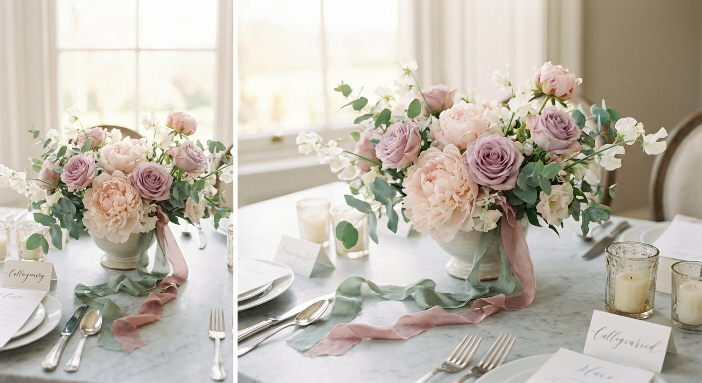
Sage Green and Dusty Rose
This palette has been building momentum for several seasons and reaches its peak in spring 2026. Sage green provides a grounded, natural base that works equally well in rustic and refined settings, while dusty rose adds warmth and romance without the sweetness of brighter pinks. Together they create a palette that feels both contemporary and timeless. Apply sage green to your larger visual elements: table linens, ceremony arch greenery, groomsmen ties, and invitation backgrounds. Reserve dusty rose for focal points like bridesmaid dresses, floral accents, ribbon details, and dessert table styling. The interplay between the two creates depth without complexity, making this one of the most versatile palettes of the season. Flowers that embody this combination include garden roses, ranunculus, astilbe, and eucalyptus.
Lavender, Cream, and Soft Gold
Lavender is having a major moment in 2026 wedding design. This palette pairs the gentle purple with cream and soft gold accents to create a look that feels dreamy without tipping into whimsy. The cream provides a clean, bright foundation, lavender introduces color with restraint, and gold elevates the entire combination with subtle warmth and refinement. This palette shines in garden and vineyard settings where natural light can bring out the nuance in each shade. Stationery in this combination looks particularly striking: cream card stock with lavender letterpress and gold foil details. For florals, consider sweet peas, stock, lilac, and white peonies with touches of dried lavender. Bridesmaids in soft lavender dresses against a backdrop of cream draping and gold accents create photographs with extraordinary tonal range.
Terracotta, Olive, and Ivory
For couples who want warmth and earthiness without the pastel softness that dominates most spring palettes, this Mediterranean-inspired combination delivers. Terracotta brings a rich, sun-baked warmth that feels bold yet organic, olive green adds depth and a connection to the natural world, and ivory keeps everything elegant and grounded. This palette translates beautifully to outdoor celebrations, particularly those with stone, wood, or adobe elements in the venue. Terracotta works well in ceramics, candle holders, and table runners, while olive appears naturally through greenery and foliage-heavy floral arrangements. Ivory ties the two together through linens, bridal attire, and soft lighting. Popular floral choices include dried palms, Italian ruscus, coffee-toned roses, and ranunculus in warm amber tones.
French Blue, White, and Blush
French blue, that particular shade of dusty, muted blue that recalls antique china and Provencal shutters, anchors one of the most elegant spring palettes of 2026. Paired with crisp white and the faintest blush pink, it creates a combination that feels polished, fresh, and endlessly photogenic. This is the palette for couples who want color without heaviness and tradition without stuffiness. French blue bridesmaid dresses have become one of the most requested items in bridal shops this season, and for good reason. The shade flatters a wide range of skin tones and photographs beautifully in both natural and artificial light. White and blush appear through florals like garden roses, anemones, peonies, and hydrangea, with blue accents through table runners, napkins, ceremony ribbons, and watercolor stationery.
Buttercream, Sage, and Taupe
This is the palette for couples who love neutrals but want something more dynamic than an all-white or all-cream scheme. Buttercream, a warm yellow-tinged cream, provides a softer alternative to stark white. Sage brings subtle color through greenery and linens, and taupe adds sophistication through deeper tones in textiles and details. The combination feels like a spring morning in a countryside garden: warm, gentle, and naturally beautiful. This palette works particularly well for morning and afternoon celebrations where natural light is abundant. Bridesmaids can wear sage or taupe dresses, groomsmen can match with sage ties and taupe suits, and the couple can stand out in classic white and ivory against a backdrop of these warm, complementary tones.
How to Apply Your Color Palette to Wedding Stationery
Your stationery suite is the first tangible expression of your wedding palette, and it sets guest expectations for the entire celebration. Getting the colors right on paper requires attention to printing methods, paper stock, and the way colors translate from screen to physical material.
Letterpress printing produces muted, tactile results that suit the soft palettes trending this spring. Digital printing offers more vibrancy and precision for couples who want their colors to appear exactly as designed. Foil stamping in gold, rose gold, or copper adds a metallic accent that elevates any spring palette. When ordering stationery, always request printed color swatches rather than relying on screen previews. The difference between a sage green on your monitor and a sage green on cotton card stock can be significant.
Carry your palette through the full suite: save-the-dates, invitations, RSVP cards, menus, programs, place cards, and signage. Consistency across these elements creates a polished impression that guests notice even if they cannot articulate why everything feels so put together. Your wedding website should mirror these colors as well, creating a seamless visual experience from the first digital touchpoint through the printed materials guests hold in their hands on the day.
Choosing Bridesmaid Dresses That Work With Your Palette
Bridesmaid dresses are one of the largest blocks of color in any wedding photograph, which makes them one of the most important palette decisions you will make. The trend for spring 2026 leans heavily toward mismatched bridesmaid dresses in coordinating tones rather than identical gowns in a single shade.
This approach works particularly well with the nature-inspired palettes dominating this season. A wedding party in varying shades of sage, moss, and eucalyptus creates a rich tonal effect that looks organic and intentional. Similarly, a group wearing different shades of dusty rose, mauve, and blush produces a gradient effect that photographs beautifully and allows each bridesmaid to choose a shade that flatters her skin tone.
When selecting fabrics, consider how your color palette reads in different materials. Chiffon renders pastels with a soft, ethereal quality. Velvet deepens colors and adds richness, making it ideal for the warmer terracotta and olive palettes. Satin reflects light and brightens any shade, which works well for French blue and lavender. The fabric choice can shift how your palette reads as much as the colors themselves.
Provide your bridesmaids with physical fabric swatches rather than digital color codes. The specific shade matters enormously when multiple dresses need to coordinate, and a swatch eliminates guesswork and ensures everyone orders from the same visual reference.
Selecting Flowers That Bring Your Spring Palette to Life
Spring is the most abundant season for wedding flowers, and the palettes trending in 2026 are designed to take full advantage of what nature offers between March and May. Working with seasonal blooms not only keeps costs manageable but produces arrangements that look naturally beautiful because the flowers are at their peak.
For sage and dusty rose palettes, build your arrangements around garden roses, ranunculus, astilbe, and lisianthus for the pink tones, with eucalyptus, Italian ruscus, and olive branch for the green elements. Lavender palettes benefit from sweet peas, stock, delphinium, and wisteria, flowers that are naturally available in spring and carry the scent as well as the color of the season.
Terracotta palettes require more creative sourcing. Dried elements like pampas grass, bunny tails, and dried palms provide the warm earth tones, while fresh blooms in amber, rust, and deep peach fill out the arrangements. Chocolate cosmos, toffee roses, and cappuccino-toned lisianthus are increasingly available through specialty growers and add incredible depth to warm-toned bouquets.
French blue palettes present a unique challenge since very few flowers are naturally blue. Delphiniums and hydrangea are your primary options for true blue, supplemented by thistle, eryngium, and blue veronica. Most designers complement these with abundant white and blush florals, using blue as an accent rather than a dominant floral color and introducing it more heavily through ribbons, vessels, and textiles.
Building a Tablescape Around Your Color Palette
The reception table is where your color palette gets its most detailed expression. Every element on the table contributes to the overall palette: linens, napkins, plates, glassware, candles, centerpieces, place cards, and menu cards each carry color into the guest experience.
Start with your linen choice, as this is the largest surface area and sets the foundation. White and ivory linens remain the most popular base for spring weddings because they allow other elements to provide color without overwhelming the table. For bolder palettes like terracotta and olive, consider sand or natural linen runners over white tablecloths to introduce warmth at the foundation level.
Napkins are an underrated opportunity to inject your accent color. A sage green napkin on a white plate or a dusty rose napkin folded into a menu card adds a deliberate pop of color at every place setting. Colored glassware, particularly in amber, sage, or soft blue, has become one of the defining tablescape trends of 2026 and adds vertical color to the table that linens and plates cannot.
Candles extend your palette through warm tones. Taper candles in cream, blush, terracotta, or sage sit in brass, gold, or ceramic holders that complement your broader material palette. The candlelight itself adds warmth to every color in the room as the evening progresses, which is why many designers recommend choosing palette colors that look their best in warm, low light rather than exclusively in bright daylight.
Frequently Asked Questions About Spring Wedding Color Palettes
How many colors should a spring wedding palette include?
Most successful wedding palettes include three to five colors: one or two dominant tones that appear across major elements, one or two accent colors that add interest and depth, and a neutral that ties everything together. Fewer than three colors can feel flat, while more than five risks looking chaotic. The palettes recommended for spring 2026 typically follow a three-color structure with the option to extend through tonal variations of each shade.
How do I make sure my color palette works with my venue?
Visit your venue at the same time of day as your ceremony and reception. Take photographs of the walls, floors, and existing decor, then compare these against your palette swatches. Neutral venues with white or stone walls accommodate virtually any palette. Venues with strong existing colors, like red brick or dark wood, require palettes that complement rather than compete. When in doubt, lean toward softer, more muted palette choices that harmonize with architectural elements rather than fighting them.
Can I use fall or winter colors for a spring wedding?
You can use any colors you love regardless of season, but certain shades look more natural and photograph better in spring light conditions. Deep burgundy and forest green, while beautiful in November, can feel heavy against the bright, airy light of an April afternoon. If you love darker tones, consider their muted spring equivalents: dusty mauve instead of burgundy, sage instead of forest green, terracotta instead of rust. These deliver a similar emotional feel while harmonizing with the spring environment.
How do I communicate my color palette to vendors?
Create a physical palette board with fabric swatches, paint chips, and printed color references rather than relying on verbal descriptions or screen-based images. Pantone color codes provide universal reference points that professional vendors understand. Share your palette board at every vendor meeting and include photographs of your inspiration images with specific notes about which colors you are referencing. The more precise your communication, the more cohesive the final result.
Should my online RSVP and wedding website match my color palette?
Absolutely. Your wedding website and digital RSVP page are often the first visual touchpoint guests experience after receiving your save-the-date. Matching your palette across digital and physical materials creates a cohesive brand experience that feels intentional and polished. Platforms like WeddingRSVP.org offer customizable themes that let you apply your exact palette colors to your online presence, ensuring every guest interaction from invitation to RSVP to day-of details reflects the same visual identity.
Your spring wedding color palette is not a cosmetic afterthought. It is the visual foundation that every other design decision builds upon. The palettes trending for spring 2026 reflect a broader shift toward natural elegance: colors drawn from the real world, applied with sophistication, and designed to create an atmosphere that feels both beautiful and authentic.
Start your palette selection early, invest in physical swatches, and communicate your choices clearly to every vendor on your team. When your colors are right, the entire celebration falls into alignment. The flowers complement the dresses, the stationery sets the tone for the tablescapes, and every photograph captures the cohesive vision you built from the very first swatch.
Spring is a season of renewal and possibility. Let your palette reflect that energy, choosing colors that make your celebration feel alive, intentional, and unmistakably yours.